Greenville Zoo

A Hypothetical Rebrand
The Greenville Zoo is a family-friendly destination dedicated to connecting people with animals and nature. Located in the heart of Greenville, South Carolina, the zoo is home to a variety of wildlife from around the world and offers fun, educational experiences for visitors of all ages. With a focus on conservation, learning, and community, the Greenville Zoo inspires curiosity, encourages care for the planet, and creates lasting memories for families and school groups alike.
To help the Greenville Zoo stand out amongst its competitors, and question was brought about.
How might a visual identity system for the Greenville Zoo create an engaging, educational experience for
all ages?

Process Work
I researched multiple animal attractions in South Carolina to understand their branding and marketing. Along will the Greenville Zoo’s current branding and marketing to get a better understand of what the Zoo needed.
Audits

Before I started to create visual directions, I created various mood boards to help me stay focused on my original goal.
Moodboards


To help me narrow down on what visual direction I wanted to use, I created multiple different visual directions. And taking feedback I was able to combine what worked in each direction to create something strong and unique for the final outcome.
Multiple Directions
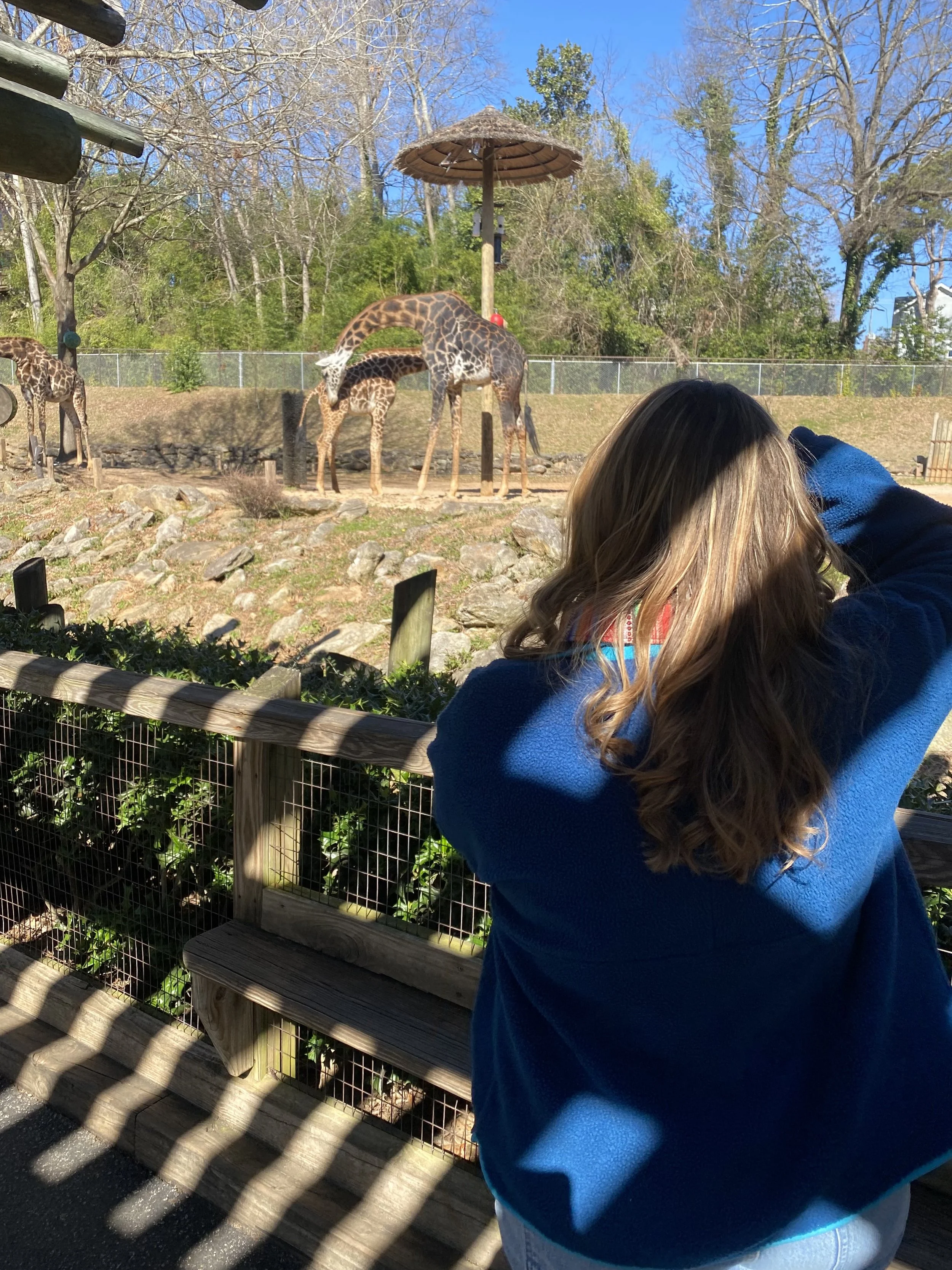
Do to the Greenville Zoo being close to campus, I was able to visit multiple times to get a real understand what the Zoo was all about. Along will being able to take many photos for my research and future mockups.
In Person Research

Final Direction
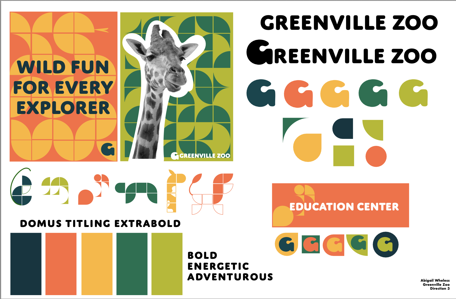
The hues are inspired by safari landscapes: vibrant oranges, earthy greens, and deep teal. These colors not only reinforce the spirit of exploration but also reflect the playful, energetic personality of the zoo.
Colors

Atrament Semibold adds a bold, playful tone that appeals to families and kids, while Commuter Sans keeps things clean and easy to read across signs, educational materials, and digital content.
Typography

Logo

The logo combines a bold “G” from Atrament Semibold with a custom giraffe illustration, creating a mark that feels both strong and playful. It reflects the Greenville Zoo’s unique personality and sense of wonder and adventure.
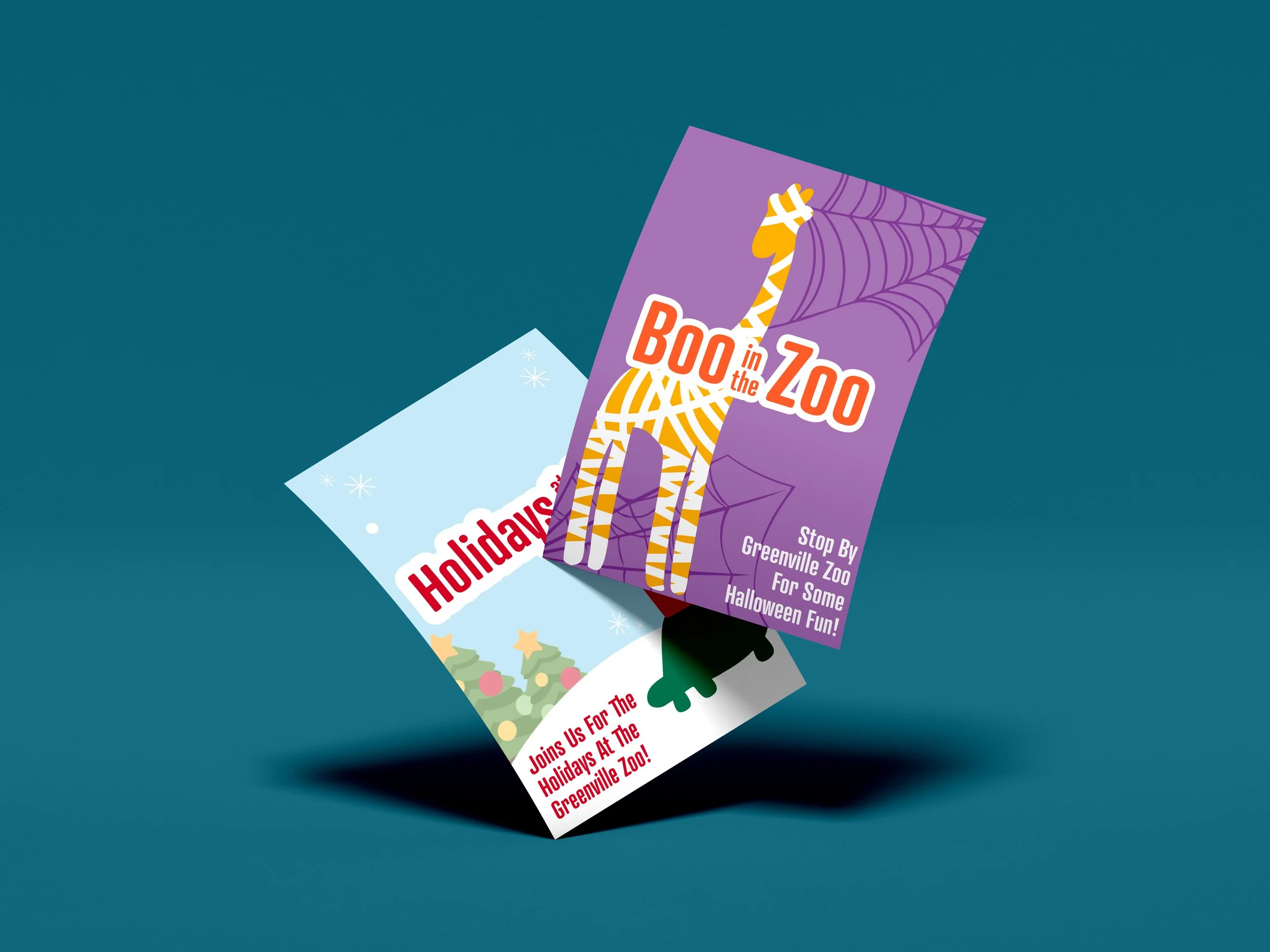
The Lockup integrates the logo paired with the rest of the bold, blocky lettering, the lockup is strong, adaptable, and memorable—perfect for signage, merchandise, and digital use.
Lockup
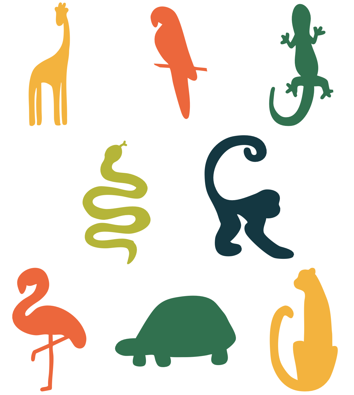
The illustrations are inspired by the unique shapes of animals, adding movement and imagination to the brand. These hand-drawn elements create a friendly, kid-focused feel and highlight the zoo’s themes of education, exploration, and fun.
Illustrations

The wordmark pairs seamlessly with the logo, reinforcing the zoo’s identity as a place of curiosity, fun, and discovery for all ages.
Wordmark